
Send Your Inquiry Today
The Ultimate Guide to Custom Packaging Boxes Printing: Elevate Your Brand in 2026
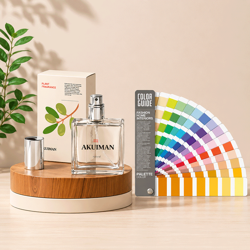
Box printing is two crafts stacked on top of each other: structural work (board, dieline, cut, crease) and graphic work (ink, color, finish). Most quality complaints — washed-out colors, foil that flakes, cartons that crack at the fold — trace back to a decision made at the specification stage, not on press. This guide walks through the printing process for custom packaging boxes the way a factory sees it, so you can specify a job that prints right the first time.
Choosing the Printing Process
| Process | Economic MOQ | Best substrate | Strengths | Watch out for |
|---|---|---|---|---|
| Offset litho-lamination | 1,000–3,000+ | Printed sheet laminated to corrugated | Finest detail, full color, magazine-grade | Two-step process; higher setup cost |
| Flexo (direct) | 500–1,000+ | Corrugated, kraft | Cheapest per unit at volume; fast | Coarser line screens on flute bumps |
| Digital | 1–500 | Folding carton, labels | No plates; variable data; fastest turnaround | Unit price flat at higher volumes |
| Screen | 500+ | Rigid boxes, specialty | Thick ink layer, spot effects | Slow; limited fine detail |
The practical rule: digital for launches and market tests under ~500 units, flexo for simple corrugated at volume, offset lamination when the box is a primary retail pack that must look flawless. If you are still deciding which box type your product needs, settle structure first — the substrate dictates the process.
Color Management: How to Get the Red You Approved
Brand colors are specified in Pantone (spot) or CMYK (process). Spot ink is mixed physically to a formula and is the only way to guarantee an exact brand color across runs. CMYK builds the color from four process inks — excellent for photography, approximate for brand colors. Two factory disciplines keep color honest:
Ink drawdowns before mass production. A drawdown is your actual ink on your actual board, dried, before the run commits. Approve color against a drawdown, never against a screen.
Colorimetric tolerance. Professional factories measure deviation between proof and print in ΔE. A ΔE of 2 or less is commercial color-matching standard on matched stock; above 3–4, the human eye starts noticing drift. Ask your supplier what tolerance they commit to in writing — it separates real printers from brokers.
One more color truth: the same ink looks different on different papers. Uncoated kraft absorbs ink and shifts colors darker and flatter; coated art paper keeps them bright. If your boxes and bags must match, specify both jobs on the same paper family and approve a cross-material drawdown.
Finishes: The Cost Ladder
| Finish | Effect | Cost impact | Notes |
|---|---|---|---|
| Matte/gloss lamination | Protection + sheen control | Low | Standard on retail cartons |
| Spot UV | High-gloss accents on matte field | Low–moderate | Great logo pop at modest cost |
| Hot foil stamping | Metallic foil (gold/silver/holographic) | Moderate (per color/area) | Premium perception leader |
| Embossing / debossing | Raised or recessed relief | Moderate | Combines beautifully with foil |
| Soft-touch coating | Suede-like tactile surface | Moderate | Luxury cosmetics and spirits |
Proofing: Never Skip the Hard Proof
Digital proofs confirm layout and content. Only a hard proof (or press check) confirms color, finish, and substrate feel. The sequence that avoids disasters: dieline approval → digital proof for content → hard proof or print sample for color and finish → golden sample sign-off → mass production locked to the golden sample. That final step is what protects you when a re-order a year later must match the first run.
Frequently Asked Questions
What files does the printer need?
Vector artwork (AI/PDF) with 3mm bleed, Pantone references for brand colors, dieline as a separate layer, and fonts outlined. For structural work, supply the product’s exact dimensions and weight so the factory engineers the board grade and inserts — this is part of any professional manufacturer’s prepress process.
Why do colors look different on different paper or boxes?
Ink is semi-transparent; the substrate underneath shifts it. Coated boards reflect light through the ink for brighter color; uncoated kraft absorbs ink and darkens it. Same brand red on kraft and on art paper will visibly differ unless the printer compensates with separate ink mixes per substrate — which is exactly what a cross-material drawdown catches.
Foil or spot UV — which gives more premium feel per dollar?
Spot UV on a matte lamination is the best value accent; hot foil is the stronger luxury signal and pairs with debossing for tactile depth. At equal budget, one restrained foil element usually beats full-flood gloss everywhere. For a broader comparison of print methods themselves, see Mastering Packaging Printing.